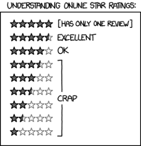
As a developer with a variety of apps in the store my ratings are super important to me. But even more important than the actual ratings of my apps are the perceived ratings of my apps. What exactly do I mean? Well I think this comic by Randall Munroe sums it up best:
Quite frankly that little sliver of pixels can make a huge difference. Especially the jump from 3.5 stars to 4.0 stars. But one of the things I’ve always found interesting is what ‘3.5 stars’ actually means. Where exactly is the cutoff? Does 3.5 stars mean 3.5 or lower? Or does it mean the closest star value (3.25 to 3.75)? Or does it mean something completely different?
Well it turns out it isn’t really straightforward to answer this question for two big reasons:
1) Stars are different in different locations. The web shows stars different than the app, and at times different pages have showed them different as well.
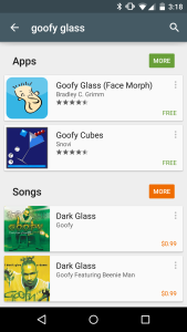
Here’s Goofy glass on mobile with 4.5 stars on the left, and 4.0 stars on the right (web).
2) The metric changes from time to time. Users probably never notice, but what a 4.0 app is today, isn’t necessarily what it was yesterday.
The Old Metric
What was the old metric? Well it was actually relatively simple compared to how it works now. The old rule was simple, round to the nearest half star. So for instance:
4.75 - 5.0 = 5 stars
4.25 - 4.75 = 4.5 stars
3.75 - 4.25 = 4 stars.
And so on…
This meant that from a realistic perspective most of my apps fit into the 4-star rating. My voice changers (notoriously low rated) fit into the 3.5 stars, and Goofy Glass at one point broke into 4.5 stars.
Then one day tons more reviews started rolling in. In fact I started getting as many as 5x to 10x more reviews. What had changed? The Play Store started prompting users to rate apps with the promise of providing similar apps the user would love. This had two side effects: 1) Lot’s more ratings were showing up on apps. 2) The ratings were generally lower (though arguably more accurate). Users often just uninstall an uninteresting app, but now were being prompted for a rating. They also were asked a slightly different question… Instead of: “What should this app be rated?” it was: “Would you like us to find apps similar to this one?” And that question effects ratings significantly.
[caption id=”attachment_408” align=”alignnone” width=”300”]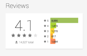 Goofy Glass (Used to show a 4.3)[/caption]
My apps all took a dive after that. Goofy Glass which had been trending upward for the past few months, started dipping without any indication as to why. And even worse, the ‘recommendation’ reviews don’t come with comments, so no valid feedback comes through to help improve the app, if they ran into issues, or what they’d like to see to win them back.
The New Metric (Mobile)
I’m guessing Google noticed the dip in ratings. And since then they’ve played with a few different displays. The most recent one is particularly interesting. They’ve effectively gotten ride of whole stars in favor of half-star ratings. The new ratings are as follows:
5.00 = 5.0 stars
4.01 - 4.99 = 4.5 stars
4.00 = 4 stars (Must be exactly 4.0)
3.01 - 3.99 = 3.5 stars
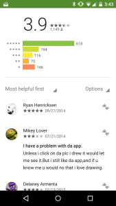
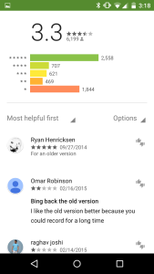
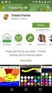
In my opinion this is really weird. That means that my painting app, which has generally favorable reviews gets lumped with my voice changers, which have pretty bad reviews. And if you take a look at the difference in graphs… you’ll notice they really don’t seem to fit into the same category. Palette Painter (with a 3.9 review) seems to have tons of fans with just a few haters. While Funny Voice Changer has almost as many haters and fans. Yet, they both show up with a 3.5 star rating to anyone looking.
Now admittedly they’ve also made it easier to see the exact number (see the 3.9) on the app page itself. But of course that is after they click on the app, and if you are like me… 3.5 stars apps just aren’t worth my time (while a 4.0 star app often is).
The New Metric (Web)
The web on the other hand does something completely different. They fill in stars as a percentage of the full star. What that means (in theory) is that if you had a 4.1 star rating it would show up with 10% of the last star filled.
I actually like idea if it can be implemented correctly. The only problem I see with the current iteration is that the percentage stars don’t start on the left and right side of the star. They actually start in the space between. What this effectively means is a 4.2 star looks identical to a 4.0 star and a 3.9 star. While a 3.3 has a little tiny bit of a sliver being drawn in.
[caption id=”attachment_414” align=”alignnone” width=”300”]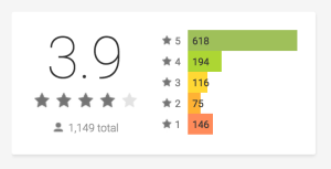 Palette Painter[/caption]
[caption id=”attachment_412” align=”alignnone” width=”300”]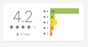 Spot the Animals[/caption]
[caption id=”attachment_413” align=”alignnone” width=”300”]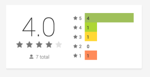 Scary Voice Changer Pro[/caption]
[caption id=”attachment_415” align=”alignnone” width=”300”]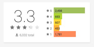 Scary Voice Changer - Hey look: A sliver![/caption]
Effectively this means that the difference form web to mobile can be a full visual star. Anyway, I don’t know if anyone else has noticed these weird ratings. And I’d be really curious to hear the reasonings behind them, but I just thought I’d call them as I see them.
