A couple years ago I released one of my favorite apps, Goofy Glass. Since that initial release I have pushed out many updates. Along the way I have come across a variety of difficult design decisions. This latest release has been especially difficult, and so I’ve decided to recap the tradeoffs I made.
Initial Design
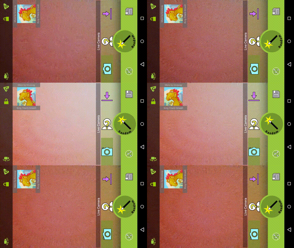
Two years ago the initial design of Goofy Glass was based on Android’s open source camera. They locked the phone into a single orientation, and then handle “orientation changes” by monitoring the sensor and simply rotating all the elements on the screen manually.
While this isn’t a very common design, it is actually a really smooth experience for a camera. There are three things that makes this nice:
- It is fast. Since the layout doesn’t change none of the surfaces or the camera have to be reinitialized.
- It makes taking pictures easy. It allows you to take photos with your left or right hand, from the top or bottom.
- It makes things simple. With only one orientation to worry about, there is a lot less design to worry about.
The Challenges
This was great, and I loved having in my app. But over the last couple of years I’ve noticed some really big drawbacks to using this method.
 Rotating buttons
In order for this method to work everything has to be rotated manually. Initially this was simply buttons, so with a little code abstraction that was easy. But in order for this to work everything I ended up needing to rotate fragments, dialogs, action bar and event toast messages. And rotating some of these items required creativity and sometimes a worse layout. For instance, fragments all had to be perfectly square so they could rotate correctly.
Problems with ads
One of the biggest problems has been with ads. For some reason still unknown to me, rotating ads causes all sorts of problems. On some devices they don’t show, on others they only show only if you add background to them. They get copped funky if you’re not careful, and the full page ads always show up toward the forced orientation. Goofy Glass actually has my lowest performing ads of all my apps, and this is one of the big reasons why.
 Confusion w/ Software Buttons
On a phone with hardware buttons it is easy to miss this. Even on a phone with software buttons you probably won’t notice, since phones tend to lock the software buttons toward the ‘bottom’ of the screen. But on a 7” tablet it is glaringly obvious. Most people use the 7 in portrait by default. When the app is locked in landscape, and the user is in portrait, the home button is on the left side of the screen, which is ugly and hard to find.
Face detection woes (other filters)
And last, but not least, it was really cramping my style. Every filter I built I had to worry about rotations, and the impact it would have. For most filters, this isn’t too terrible. But I’ve had plans to add face tracking to the app for a while, and it was getting complicated fast. Most of the programming for it is done, but finding a rotated face and rotating the effect to match the face was proving to be quite painful.
The Solution
 I finally decided the cost of this design was too high. So in this latest update I decided to finally break it apart. And wow, did it turn out to be a lot of work, much of the work was simply a process of undoing what was already in. The interesting thing is apparently the Google team had the same problems, because their latest updates don’t lock the orientation anymore either.
I will admit I’m going to miss those smooth animations. Design is almost never straightforward. And contrary to popular belief no single design will win, there will always be tradeoffs in the decisions we make.
